shared
SHARED
Role
Design
Role
Design
Tools
Figma
Tools
Figma
Duration
3 weeks
Duration
3 weeks
about
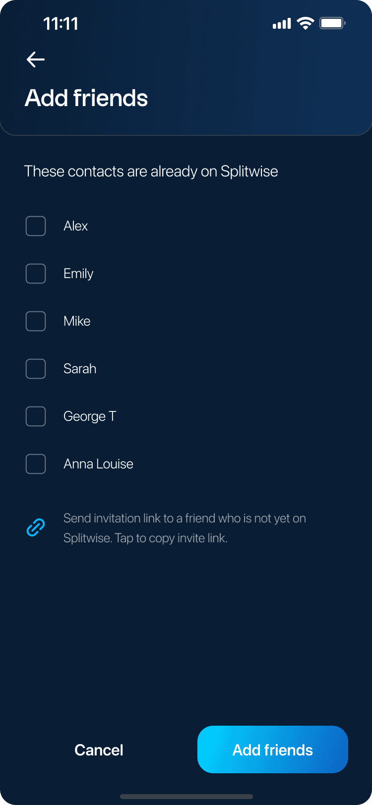
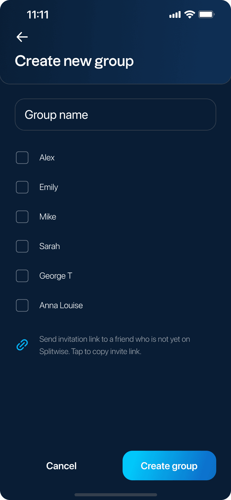
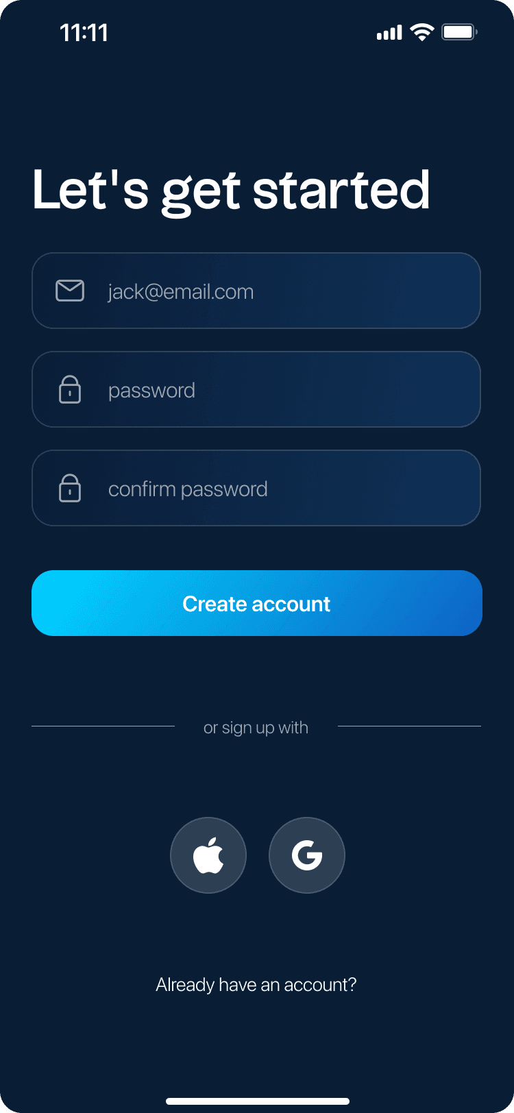
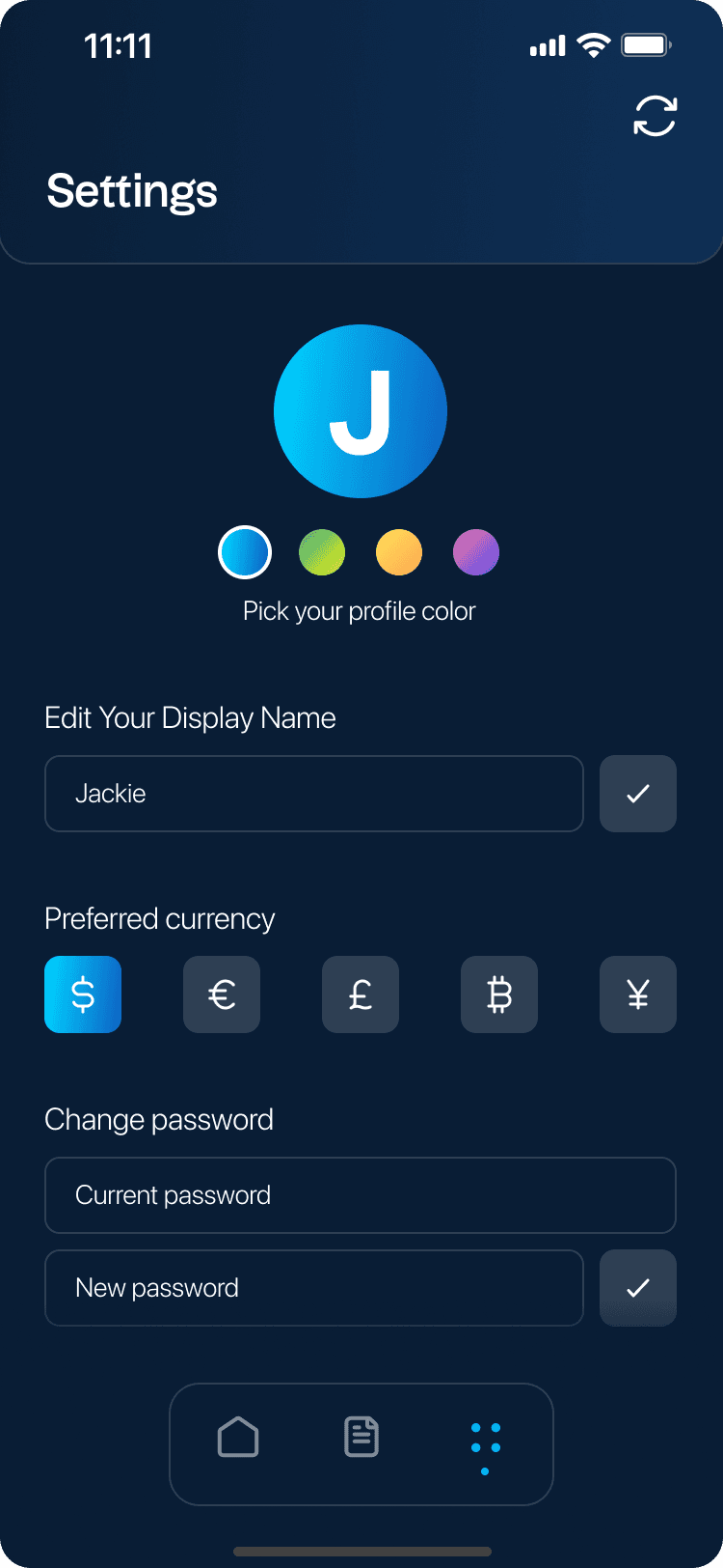
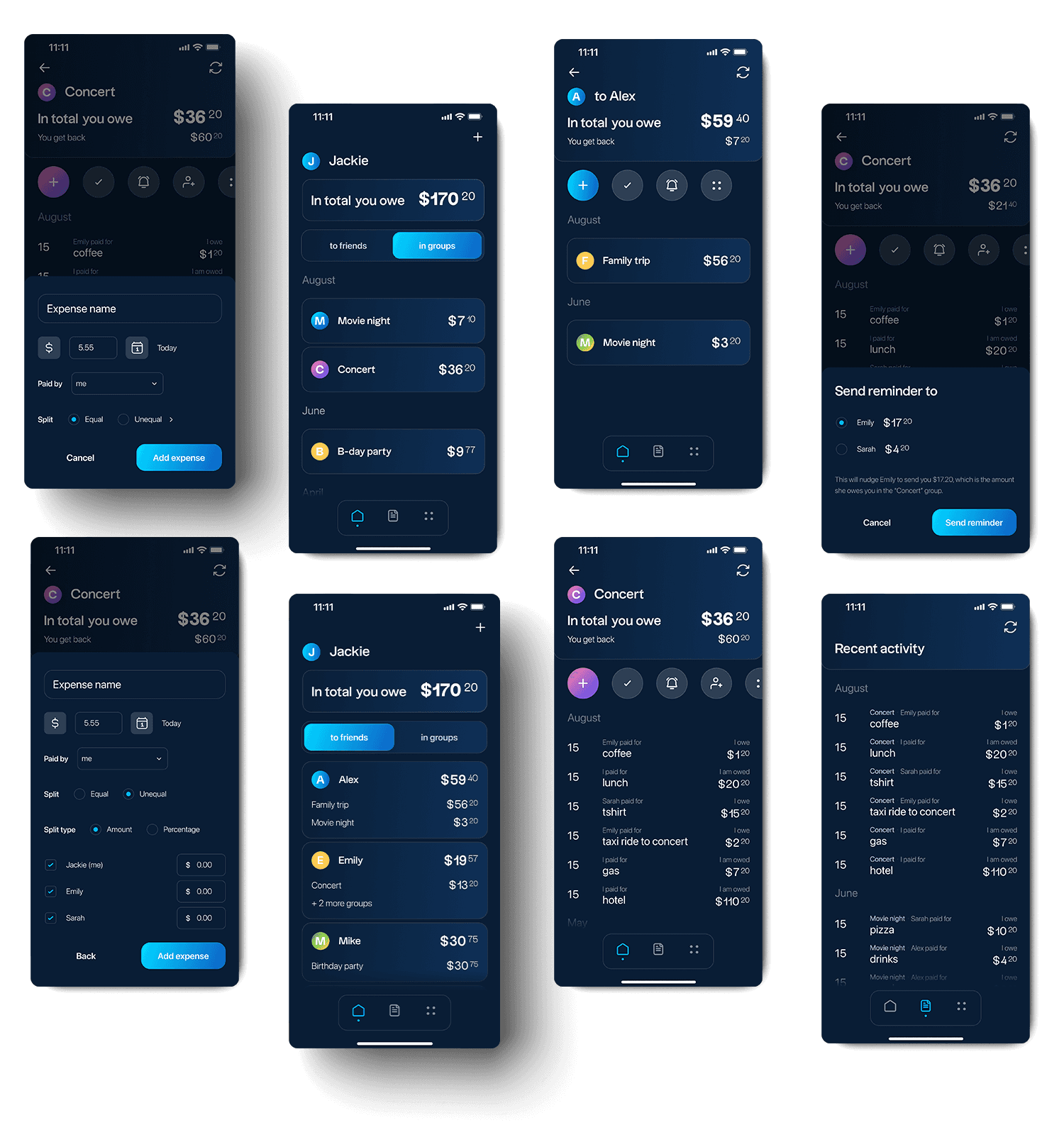
As a long-time user of expense-sharing apps, I recognized the potential for a more intuitive and user-friendly solution. Inspired by my own experiences and insights into areas that could be improved, I set out to design an app that simplifies expense management within social circles. Driven by these insights and a desire to offer a fresh approach to how friends manage expenses together, I designed an app concept that reflects my ideas, addressing common pain points.
Figma prototype
problem + solution
problem + solution
#1 Lack of visual appeal and hierarchy
Description
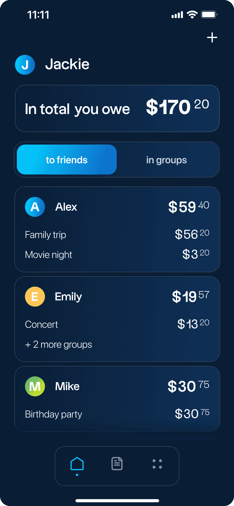
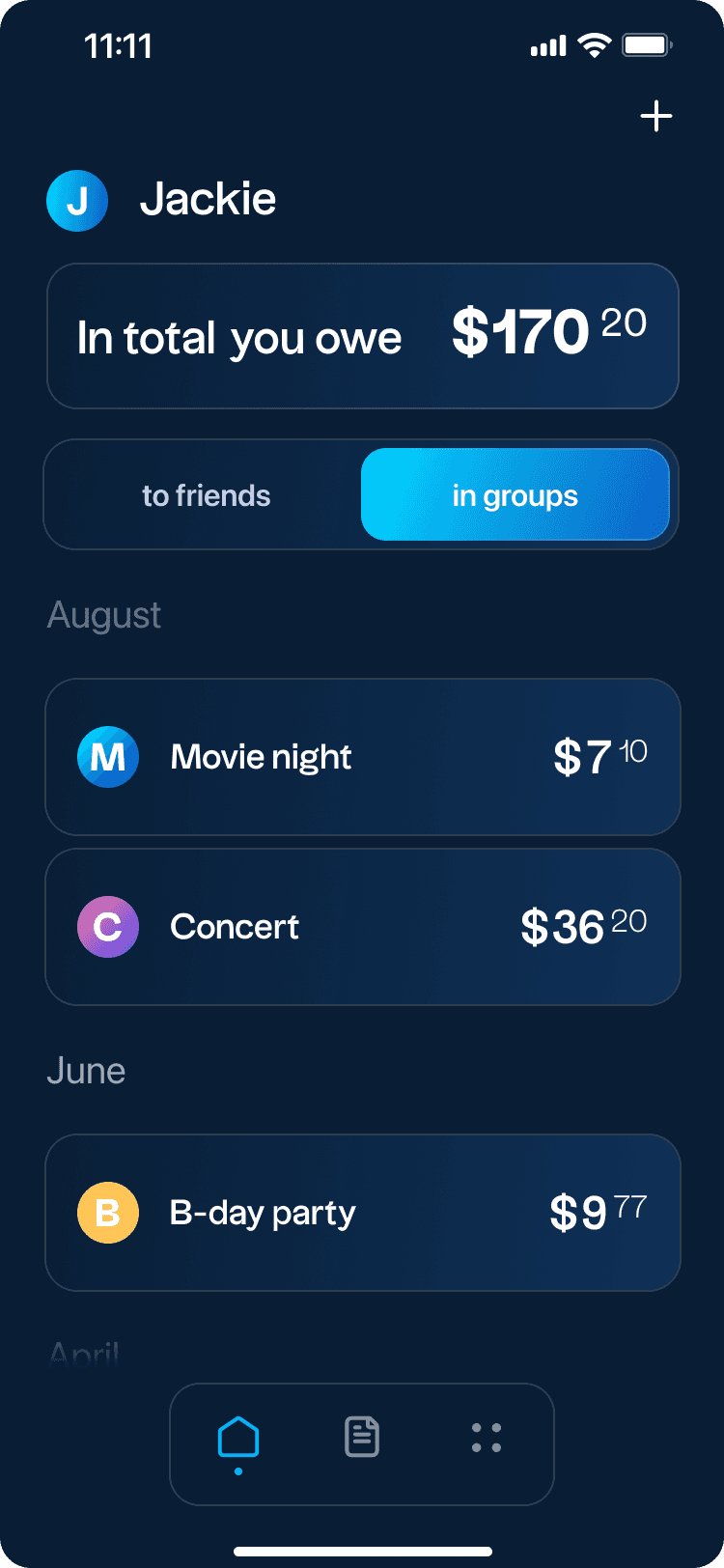
The home screen design and the design general often lacked visual appeal and failed to create a clear visual hierarchy for crucial financial information, making it challenging for users to prioritize and understand the importance of different elements and information. Additionally, the total amounts owed by the user and to the user are not prominently displayed, diminishing their significance within the app.
The home screen design and the design general often lacked visual appeal and failed to create a clear visual hierarchy for crucial financial information, making it challenging for users to prioritize and understand the importance of different elements and information. Additionally, the total amounts owed by the user and to the user are not prominently displayed, diminishing their significance within the app.
Solution
● Design the home screen with a more engaging and visually appealing layout, making it an inviting starting point for users. ● Prioritizing important elements with larger fonts, bolder text, or distinct styling. ● Using color, spacing, and placement to guide users' attention to critical information. ● Ensuring that key actions or buttons are prominently displayed and easily accessible.
● Design the home screen with a more engaging and visually appealing layout, making it an inviting starting point for users. ● Prioritizing important elements with larger fonts, bolder text, or distinct styling. ● Using color, spacing, and placement to guide users' attention to critical information. ● Ensuring that key actions or buttons are prominently displayed and easily accessible.
Impact
● A well-defined visual hierarchy helps users quickly identify and interact with essential elements. ● Enhanced clarity and organization of content can lead to a more user-friendly experience. ● Users are less likely to miss critical information or actions when a clear visual hierarchy is implemented.
● A well-defined visual hierarchy helps users quickly identify and interact with essential elements. ● Enhanced clarity and organization of content can lead to a more user-friendly experience. ● Users are less likely to miss critical information or actions when a clear visual hierarchy is implemented.
Importance
● Improving user comprehension and navigation within the app. ● Reducing user frustration and confusion. ● Enhancing overall user satisfaction and usability.
● Improving user comprehension and navigation within the app. ● Reducing user frustration and confusion. ● Enhancing overall user satisfaction and usability.


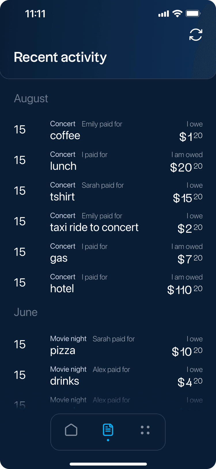

#1 Lack of visual appeal and hierarchy
Description
The home screen design and the design general often lacked visual appeal and failed to create a clear visual hierarchy for crucial financial information, making it challenging for users to prioritize and understand the importance of different elements and information. Additionally, the total amounts owed by the user and to the user are not prominently displayed, diminishing their significance within the app.
Solution
● Design the home screen with a more engaging and visually appealing layout, making it an inviting starting point for users. ● Prioritizing important elements with larger fonts, bolder text, or distinct styling. ● Using color, spacing, and placement to guide users' attention to critical information. ● Ensuring that key actions or buttons are prominently displayed and easily accessible.
Impact
● A well-defined visual hierarchy helps users quickly identify and interact with essential elements. ● Enhanced clarity and organization of content can lead to a more user-friendly experience. ● Users are less likely to miss critical information or actions when a clear visual hierarchy is implemented.
Importance
● Improving user comprehension and navigation within the app. ● Reducing user frustration and confusion. ● Enhancing overall user satisfaction and usability.


#2 Essential Action Buttons
Description
Essential action buttons within the apps, such as "Settle Up," "Remind," "Add Expense," "Add Friend to Group," and "Delete Group," suffer from small size and scattered placement. This leads to usability issues, as these vital actions are not grouped together, making them less intuitive to locate and use.
Essential action buttons within the apps, such as "Settle Up," "Remind," "Add Expense," "Add Friend to Group," and "Delete Group," suffer from small size and scattered placement. This leads to usability issues, as these vital actions are not grouped together, making them less intuitive to locate and use.
Solution
● Increasing the size of these action buttons to make them more prominent and accessible. ● Grouping them together in a dedicated section within the friend and group view for a streamlined user experience. ● Using consistent design elements and icons for these buttons to create visual unity and help users quickly identify their purpose.
● Increasing the size of these action buttons to make them more prominent and accessible. ● Grouping them together in a dedicated section within the friend and group view for a streamlined user experience. ● Using consistent design elements and icons for these buttons to create visual unity and help users quickly identify their purpose.
Impact
● Improved Usability: Larger and grouped action buttons will enhance the overall usability of the app, making it easier for users to perform essential tasks. ● Efficient Navigation: Users will spend less time searching for actions, resulting in a more efficient and user-friendly app navigation.
● Improved Usability: Larger and grouped action buttons will enhance the overall usability of the app, making it easier for users to perform essential tasks. ● Efficient Navigation: Users will spend less time searching for actions, resulting in a more efficient and user-friendly app navigation.
Importance
● User-Friendly Design: Prioritizing user convenience by improving button size and placement contributes to a more user-friendly design. ● Enhanced User Engagement: An app with intuitive controls and accessible actions encourages users to engage more actively.
● User-Friendly Design: Prioritizing user convenience by improving button size and placement contributes to a more user-friendly design. ● Enhanced User Engagement: An app with intuitive controls and accessible actions encourages users to engage more actively.
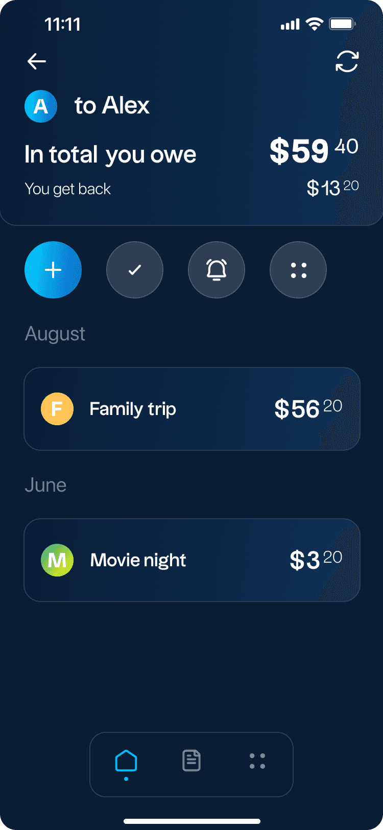

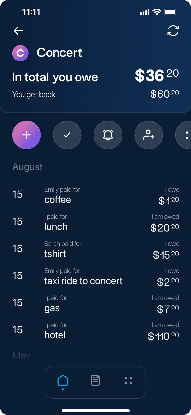

#2 Essential Action Buttons
Description
Essential action buttons within the apps, such as "Settle Up," "Remind," "Add Expense," "Add Friend to Group," and "Delete Group," suffer from small size and scattered placement. This leads to usability issues, as these vital actions are not grouped together, making them less intuitive to locate and use.
Solution
● Increasing the size of these action buttons to make them more prominent and accessible. ● Grouping them together in a dedicated section within the friend and group view for a streamlined user experience. ● Using consistent design elements and icons for these buttons to create visual unity and help users quickly identify their purpose.
Impact
● Improved Usability: Larger and grouped action buttons will enhance the overall usability of the app, making it easier for users to perform essential tasks. ● Efficient Navigation: Users will spend less time searching for actions, resulting in a more efficient and user-friendly app navigation.
Importance
● User-Friendly Design: Prioritizing user convenience by improving button size and placement contributes to a more user-friendly design. ● Enhanced User Engagement: An app with intuitive controls and accessible actions encourages users to engage more actively.


#3 Inadequate Payment Reminders
Description
Expense sharing apps often have payment reminders that are not easily accessible or entirely absent, they lack prominent and user-friendly payment reminders.
Expense sharing apps often have payment reminders that are not easily accessible or entirely absent, they lack prominent and user-friendly payment reminders.
Solution
● Introducing a clearly visible and easily accessible "Remind Friend" button within the app. ● Empowering users to send payment reminders to their friends directly, allowing for more personalized and effective reminders. ● Adding the "Remind Friend" feature to the dedicated friend view and group view, making it easily accessible from both places.
● Introducing a clearly visible and easily accessible "Remind Friend" button within the app. ● Empowering users to send payment reminders to their friends directly, allowing for more personalized and effective reminders. ● Adding the "Remind Friend" feature to the dedicated friend view and group view, making it easily accessible from both places.
Impact
● Addressing the lack of effective reminders in comparison to other apps. ● Improving the user experience by providing a straightforward means to remind friends about payments. ● Encouraging timely settlement of expenses and reducing the likelihood of overdue balances.
● Addressing the lack of effective reminders in comparison to other apps. ● Improving the user experience by providing a straightforward means to remind friends about payments. ● Encouraging timely settlement of expenses and reducing the likelihood of overdue balances.
Importance
● Offering a feature that users find in other apps, improving competitiveness. ● Enhancing user satisfaction by simplifying the process of sending payment reminders. ● Promoting financial accountability and responsible expense management.
● Offering a feature that users find in other apps, improving competitiveness. ● Enhancing user satisfaction by simplifying the process of sending payment reminders. ● Promoting financial accountability and responsible expense management.
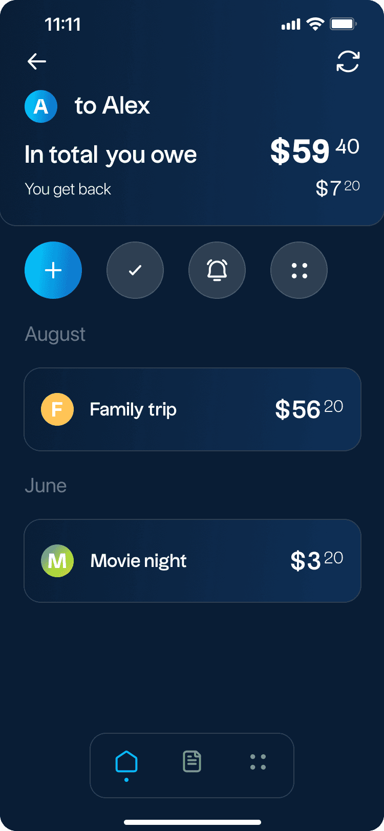

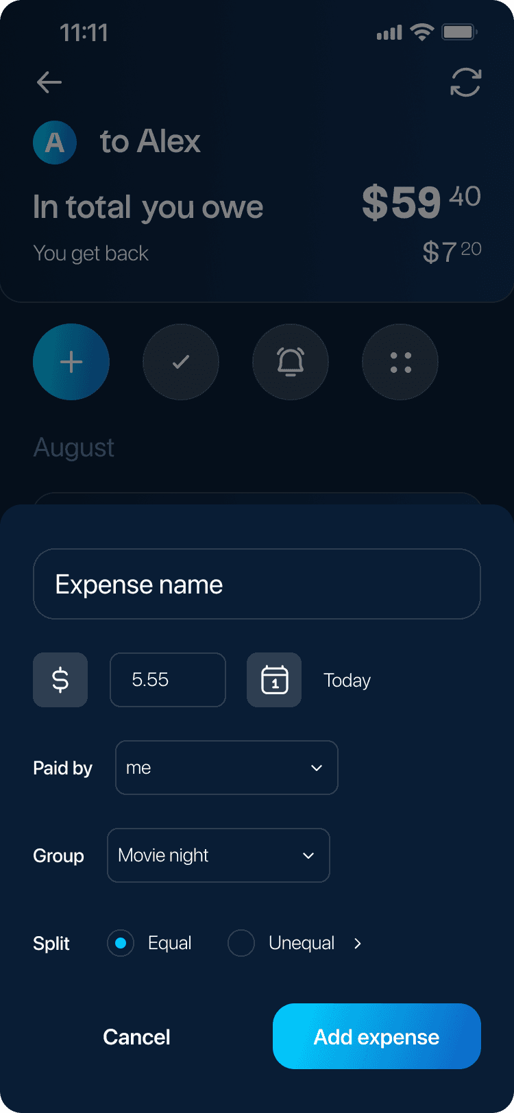

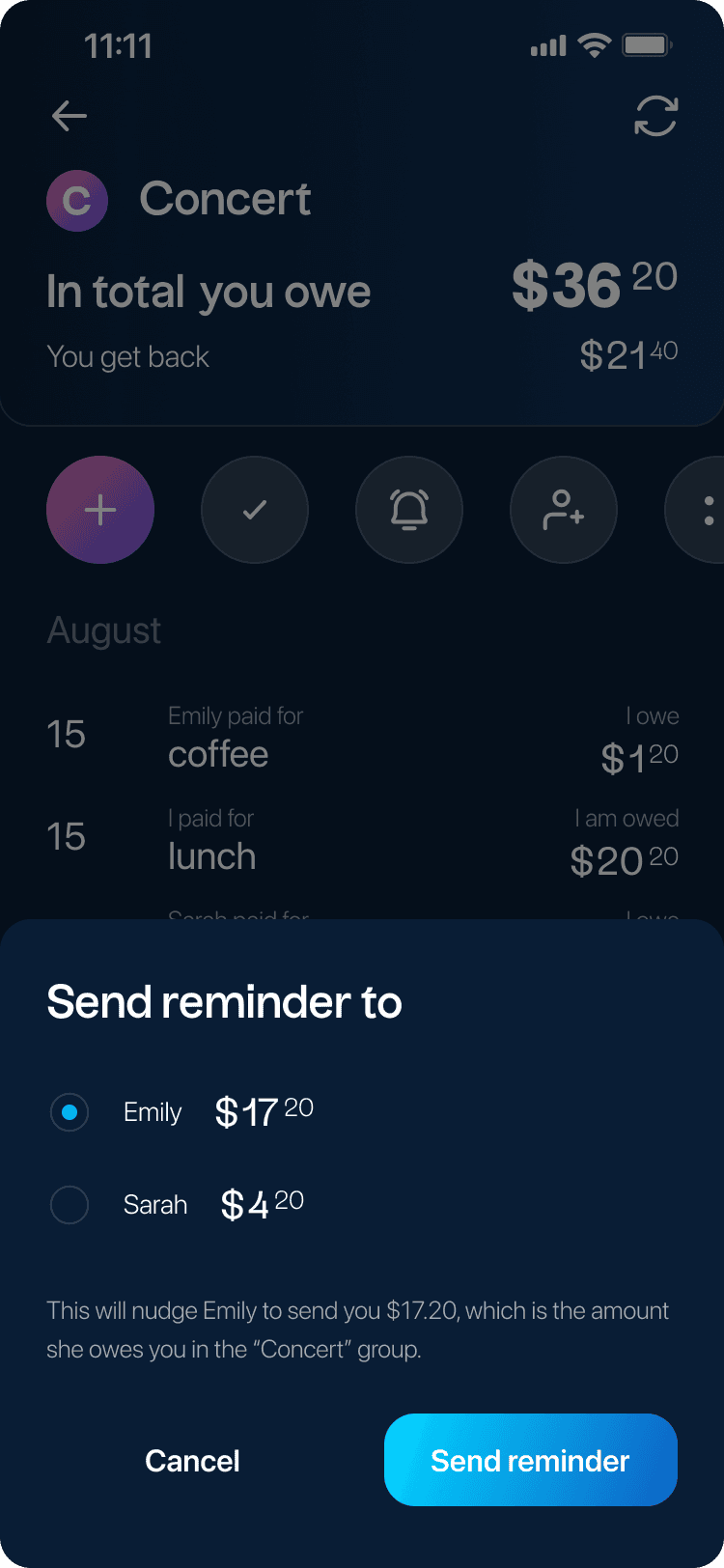

#3 Inadequate Payment Reminders
Description
Expense sharing apps often have payment reminders that are not easily accessible or entirely absent, they lack prominent and user-friendly payment reminders.
Solution
● Introducing a clearly visible and easily accessible "Remind Friend" button within the app. ● Empowering users to send payment reminders to their friends directly, allowing for more personalized and effective reminders. ● Adding the "Remind Friend" feature to the dedicated friend view and group view, making it easily accessible from both places.
Impact
● Addressing the lack of effective reminders in comparison to other apps. ● Improving the user experience by providing a straightforward means to remind friends about payments. ● Encouraging timely settlement of expenses and reducing the likelihood of overdue balances.
Importance
● Offering a feature that users find in other apps, improving competitiveness. ● Enhancing user satisfaction by simplifying the process of sending payment reminders. ● Promoting financial accountability and responsible expense management.


#4 Inefficient Expense Entry
Description
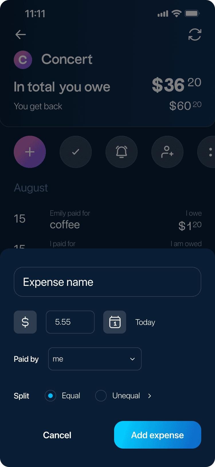
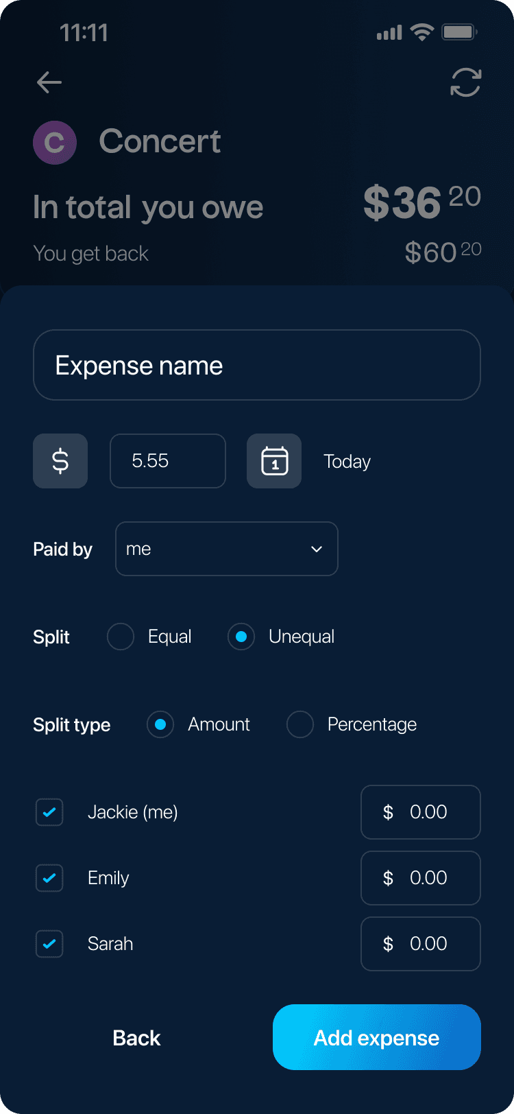
One of the app designs include an "Add Expense" button in the bottom menu, accessible from all screens, which may initially seem convenient but can lead to unnecessary complexity. As users often have multiple friends and groups, this approach can make the navigation of adding expenses challenging and less efficient. Additionally the button is not grouped with other essential action buttons.
Solution
● Simplifying the expense creation process with a user-friendly and intuitive interface. ● Offering features such as automatic expense splitting among friends or groups to minimize user effort.
Impact
● Streamlining expense entry reduces user frustration and saves time. ● A more efficient process encourages users to regularly update expenses, leading to more accurate records. ● Improved expense entry can result in a more positive overall user experience.
Importance
● Enhancing user satisfaction by reducing friction in the expense entry process. ● Encouraging users to use the app regularly and keep accurate expense records. Contributing to a more user-friendly and efficient app.


let's chat!
matea.brajdic@gmail.com
let's chat!
matea.brajdic@gmail.com
let's chat!
matea.brajdic@gmail.com


