1001 tracklist
1001 tracklist
redesign
Role
Design
Role
Design
Role
Design
Tools
Figma
Tools
Figma
Tools
Figma
Duration
1 week
Duration
1 week
Duration
1 week
about
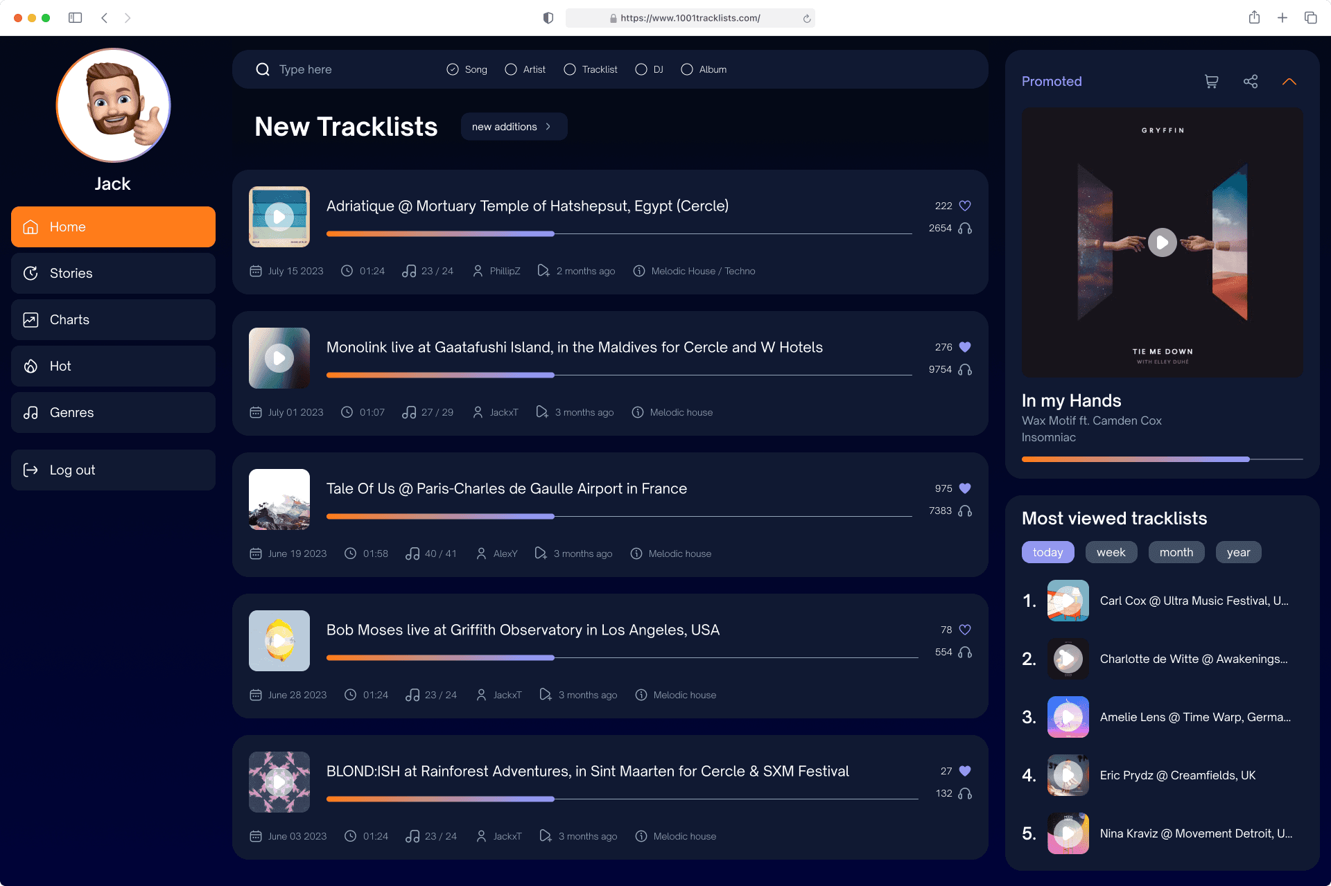
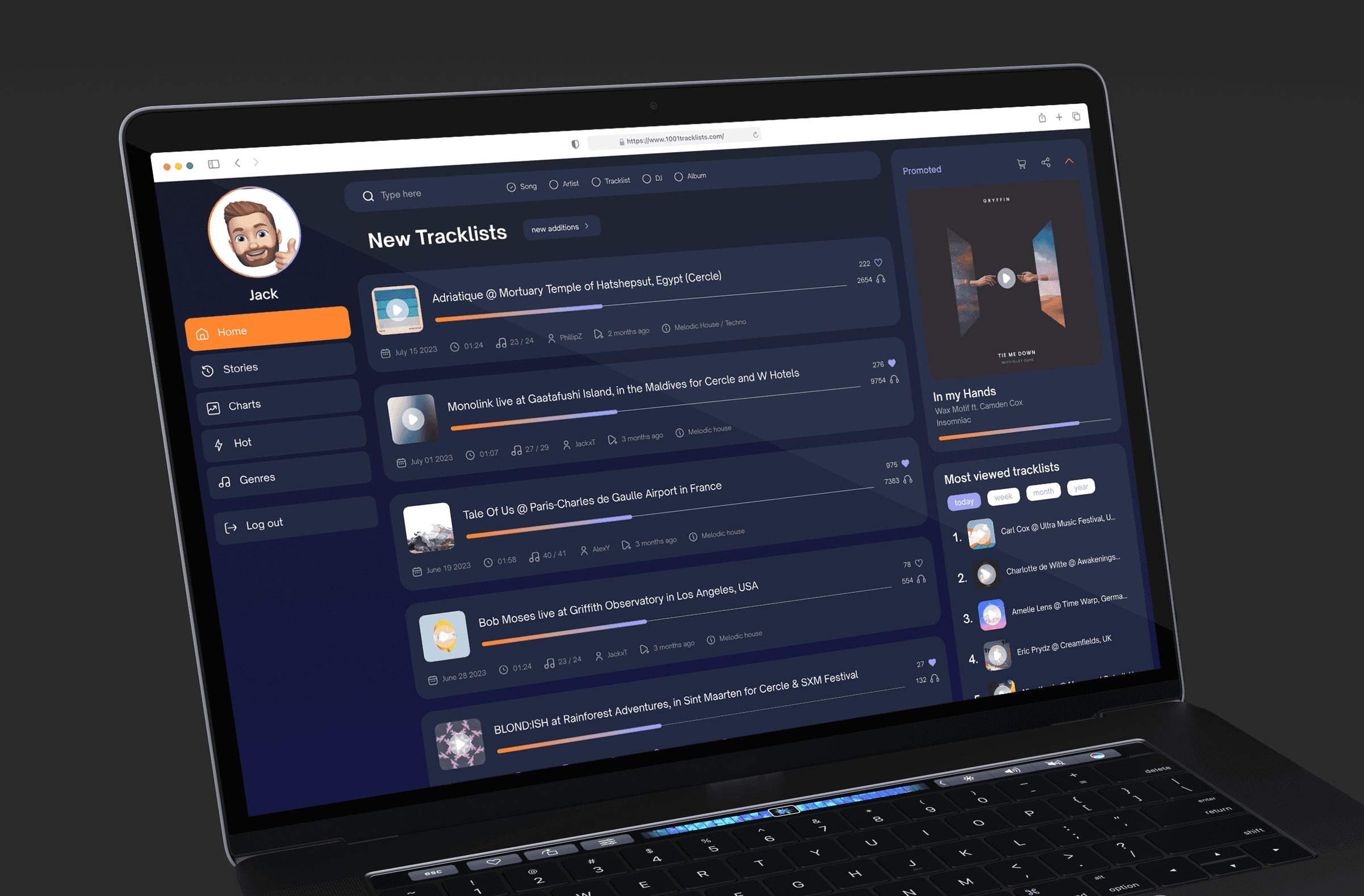
After opening the 1001Tracklists website a couple of times, I found its design to be lacking, and it didn't provide an enjoyable user experience. It felt uninspiring and I started to wonder what I could do with it. As a music enthusiast, I wanted a more user-friendly and visually appealing way to explore tracks, mixes, and DJ sets. This quick redesign project was born out of a desire to transform the site into a visually appealing and efficient hub for music discovery.
Figma prototype
problem + solution
problem + solution
Description
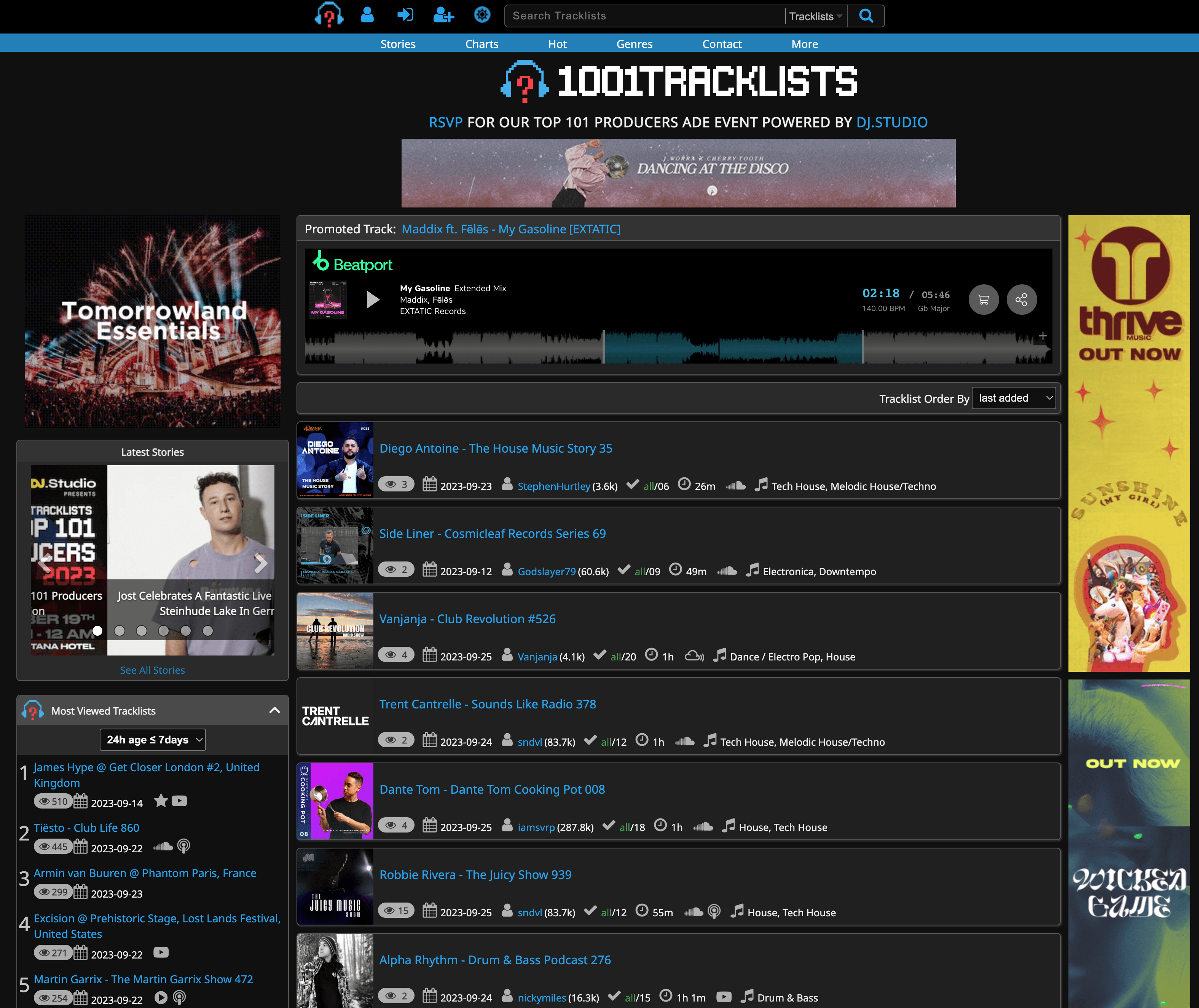
In the old design of the 1001Tracklists homepage, one of the noticeable issues was the lack of sufficient spacing between elements. The fonts used throughout the site were predominantly uniform, with the only noticeable variation being bold text, which added to the monotony of the design. Moreover, the absence of clear headings and an overall visual hierarchy made it challenging for users to quickly grasp the website's structure and content. Additionally, the website suffered from limited use of colors, primarily relying on a single color, blue, which was mainly used to indicate clickable links.
In the old design of the 1001Tracklists homepage, one of the noticeable issues was the lack of sufficient spacing between elements. The fonts used throughout the site were predominantly uniform, with the only noticeable variation being bold text, which added to the monotony of the design. Moreover, the absence of clear headings and an overall visual hierarchy made it challenging for users to quickly grasp the website's structure and content. Additionally, the website suffered from limited use of colors, primarily relying on a single color, blue, which was mainly used to indicate clickable links.
Description
In the old design of the 1001Tracklists homepage, one of the noticeable issues was the lack of sufficient spacing between elements. The fonts used throughout the site were predominantly uniform, with the only noticeable variation being bold text, which added to the monotony of the design. Moreover, the absence of clear headings and an overall visual hierarchy made it challenging for users to quickly grasp the website's structure and content. Additionally, the website suffered from limited use of colors, primarily relying on a single color, blue, which was mainly used to indicate clickable links.
Impact
● Cluttered Layout: The elements on the homepage, such as tracklists and featured sets, were densely packed together, making it challenging for users to distinguish between them. ● Visual Noise: The absence of adequate spacing created visual noise, making it difficult for users to focus on specific content or navigate the page comfortably. ● Lack of Visual Appeal: The old design lacked visual appeal, making it feel uninspiring and unattractive to users. ● Limited Font Variation: Font variation in the old design was minimal, with the primary difference being bold text, which made it challenging to create a hierarchy of text elements. ● Absence of Clear Headings: The absence of clear headings or titles in the old design hindered users' ability to identify and navigate to specific content areas. ● Limited Color Usage: The old design used a single color (blue) primarily for links. This limited color palette failed to engage users visually and enhance the website's overall aesthetics.
● Cluttered Layout: The elements on the homepage, such as tracklists and featured sets, were densely packed together, making it challenging for users to distinguish between them. ● Visual Noise: The absence of adequate spacing created visual noise, making it difficult for users to focus on specific content or navigate the page comfortably. ● Lack of Visual Appeal: The old design lacked visual appeal, making it feel uninspiring and unattractive to users. ● Limited Font Variation: Font variation in the old design was minimal, with the primary difference being bold text, which made it challenging to create a hierarchy of text elements. ● Absence of Clear Headings: The absence of clear headings or titles in the old design hindered users' ability to identify and navigate to specific content areas. ● Limited Color Usage: The old design used a single color (blue) primarily for links. This limited color palette failed to engage users visually and enhance the website's overall aesthetics.
Impact
● Cluttered Layout: The elements on the homepage, such as tracklists and featured sets, were densely packed together, making it challenging for users to distinguish between them. ● Visual Noise: The absence of adequate spacing created visual noise, making it difficult for users to focus on specific content or navigate the page comfortably. ● Lack of Visual Appeal: The old design lacked visual appeal, making it feel uninspiring and unattractive to users. ● Limited Font Variation: Font variation in the old design was minimal, with the primary difference being bold text, which made it challenging to create a hierarchy of text elements. ● Absence of Clear Headings: The absence of clear headings or titles in the old design hindered users' ability to identify and navigate to specific content areas. ● Limited Color Usage: The old design used a single color (blue) primarily for links. This limited color palette failed to engage users visually and enhance the website's overall aesthetics.


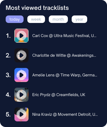
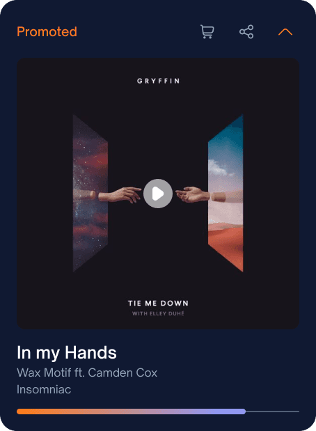
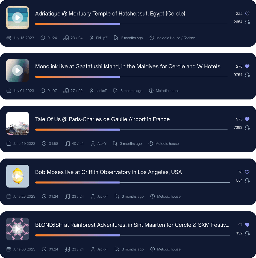
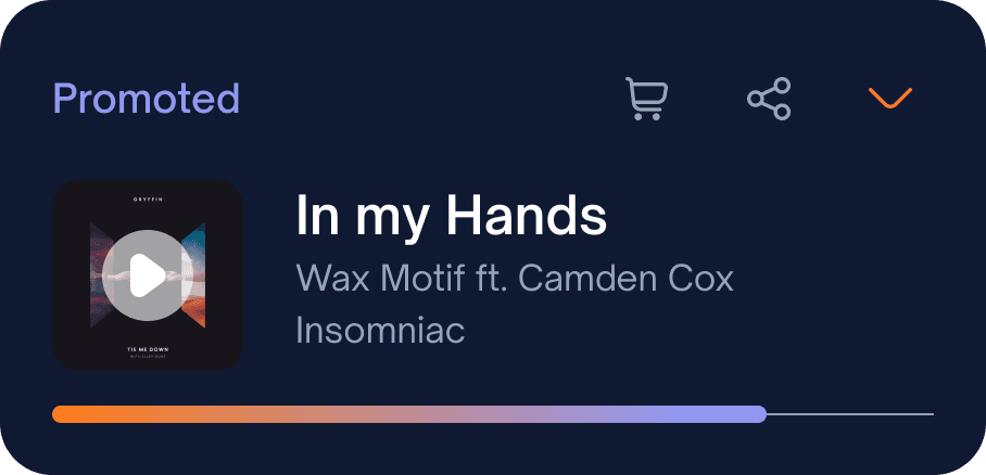
Solution
● Increase Spacing: Implement generous spacing between elements on the homepage to create a more organized and visually pleasing layout. ● Grid Layout: Utilize a grid-based layout to arrange content systematically, reducing clutter and enhancing readability. ● Card-Based Design: Implement a card-based design approach for elements to separate and highlight each item effectively. ● Font Variation: Introduce a variety of font sizes and styles to establish a clear visual hierarchy. Use larger, bold fonts for headings and important content to guide users' attention. ● Clear Headings: Incorporate clear and concise headings or titles for different content sections, aiding users in quickly identifying and navigating to their desired areas. ● Color Palette: Expand the color palette to include a broader spectrum of colors, allowing for a visually engaging and appealing design. Use colors strategically to emphasize important elements and create a more vibrant user interface.
● Increase Spacing: Implement generous spacing between elements on the homepage to create a more organized and visually pleasing layout. ● Grid Layout: Utilize a grid-based layout to arrange content systematically, reducing clutter and enhancing readability. ● Card-Based Design: Implement a card-based design approach for elements to separate and highlight each item effectively. ● Font Variation: Introduce a variety of font sizes and styles to establish a clear visual hierarchy. Use larger, bold fonts for headings and important content to guide users' attention. ● Clear Headings: Incorporate clear and concise headings or titles for different content sections, aiding users in quickly identifying and navigating to their desired areas. ● Color Palette: Expand the color palette to include a broader spectrum of colors, allowing for a visually engaging and appealing design. Use colors strategically to emphasize important elements and create a more vibrant user interface.
Solution
● Increase Spacing: Implement generous spacing between elements on the homepage to create a more organized and visually pleasing layout. ● Grid Layout: Utilize a grid-based layout to arrange content systematically, reducing clutter and enhancing readability. ● Card-Based Design: Implement a card-based design approach for elements to separate and highlight each item effectively. ● Font Variation: Introduce a variety of font sizes and styles to establish a clear visual hierarchy. Use larger, bold fonts for headings and important content to guide users' attention. ● Clear Headings: Incorporate clear and concise headings or titles for different content sections, aiding users in quickly identifying and navigating to their desired areas. ● Color Palette: Expand the color palette to include a broader spectrum of colors, allowing for a visually engaging and appealing design. Use colors strategically to emphasize important elements and create a more vibrant user interface.
let's chat!
matea.brajdic@gmail.com
let's chat!
matea.brajdic@gmail.com
let's chat!
matea.brajdic@gmail.com


